As I've
said before on the blog, a picture really is worth a thousand words. Highly informative "infographics", as they're called, are an outstanding way of broadening our understanding of politics, the environment, and pretty much any big questions you can think of.
Here are a few of my favorites:
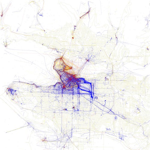
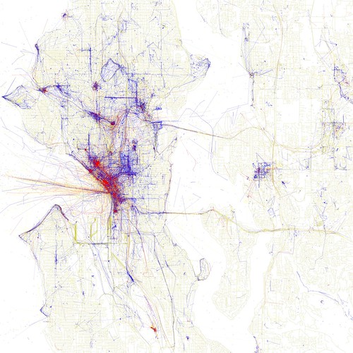
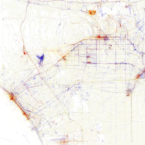
- Where do tourists take the most pictures of Vancouver? And where are the locals' favorite spots? Using geo-located photo compilations from Flickr users, Eric Fischer was able to show us a map of where their shutters go off. Blue pictures are by locals, red by tourists, and yellow is unknown.
Some other great versions of Seattle and LA:
So these pictures essentially answer the question of "where are the local secret photo spots?" I won't tell you where they are, but here are a few of my secret spots:
New York City's public non-emergency hotline - where residents report anything from complaints about trash removal, to graffiti, to noise complaints, is a virtual library of information in itself. It offers a real-time glimpse at the pulse of the city's millions.
3. Just how bad is your city's problem of urban sprawl? Take a look at the ringroads, or beltways, around the city's borders and you might get a general idea.
4. Where do people actually go when they use London's bike-sharing program? This video/graphic from
The Bike Sharing Blog tells you pretty much all you need to know.
from
Sociable Physics on
Vimeo.
5. Should I rent or buy when I move to a new city? Real estate website
Trulia has the graphic for you...Surprise! You should probably rent if you're moving anywhere cool (LA, SF, Seattle, or New York, that is).
Via:
Planetizen and
Sustainable Cities Collective